
Key Tips to Give Your Website Curb Appeal

Anita Clark
By Anita Clark
There are few things real estate agents understand better than curb appeal. It is one of the major factors motivating people to go into a house predisposed to buy. Curb appeal is one of the top factors that can shield a property from low-ball offers, and it’s one of the factors that help close the deal.
As a real estate professional, you make sure that your clients’ homes have curb appeal. But do you make sure that your own website has curb appeal? The first impression your visitors get when they land on your website sets the tone. It determines whether they will read further. If they do read further, it determines how excited they will be to do business with you.
Here are a few quick tips about to help you give your local real estate website instant curb appeal.
Use a Simple Web Design
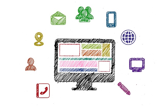
@geralt, 2017. pixabay.com
There are so many ways to design a website. You can use a lots of shapes and colors. Or, you can keep it simple.
Modern websites have a mobile-friendly, easy-to-read layout, so that even on a phone screen they come up looking great. Just like a home design, you want your website design to include smooth lines rather than being cluttered by too many elements. If it looks complicated, people will think it is complicated and you’ll lose them.
When buyers stand in front of a house, the facade tells them what to expect. Make your website do the same thing. The design should reflect your business, too. If you focus exclusively on luxury homes, trim your site with images of high-end properties. If you focus on a community or neighborhood, your imagery should communicate that. Use a color scheme that reflects your brand. Create the right expectations.
Get Rid of the Clutter
Just as in a home, clutter on a website makes the place look unkept. You might be tempted to put as much content and information as you can on your home page with the idea of providing something for everyone. But too much information simply drowns out what is most important.
Put the very most important things up front, the things that will make people dig deeper into your website or to pick up the phone and contact you. It might include a new-listings widget. It will surely include easy-to-find contact information, such as your phone number and a contact form.
Push less-important details lower on the page or to interior pages. Don’t hide them, because some people want to learn about neighborhoods in your market, mortgages rates, or how the economy is affecting home prices. Make sure viewers can easily navigate to that content without it getting in the way of the important stuff. Once you have their attention, that’s the time to answer questions and offer more details.
Use Powerful Words
Sure, you can use big, fancy, hundred-dollar words hoping to impress your visitors into listing with you. But big words usually won’t impress. Plain language will impress. People want to understand what you have to say without wasting their time.
Before you show a house, you make sure the bicycles and skateboards are in the garage, or even off the property. Don’t make your prospects trip over complex sentences when they visit your website. A simpler sentence structure that conveys information accurately will be the most helpful to your readers. And it’s not just the words you use, it’s also how you lay them out. Sound familiar? You wouldn’t just throw plants willy-nilly in front of a house you’ve listed. You place them carefully for maximum effect. The same goes for the words on your website.
Bullet lists help visitors quickly read a lot of information without having to dig for it. Subheadings are a great way organize your information. Just like people instinctively know how to navigate a well laid out house, they should have the same comfort with your website. Showing that you are organized will help instill trust your information and in you.
Show Them What To Do

@janeb13, 2016. pixabay.com
Finally, make it clear how to navigate your site, contact you, view listings, and how to list their own property. Don’t make your web visitors search to hard, and don’t be cute or cryptic with links or buttons. The more work it is to hire you, the fewer people will do it.
If you were showing a house to a prospective buyer, you would make sure it’s easy for them to find. You don’t want them to have to work to view the house, and you want them in a great mood when they step inside. Similarly, if a visitor to your website has to search too hard, you’ve already lost the client.
In Other Words…
Have you noticed a common thread through all these tips? Make your website easy, easy, easy for people to use. Make it look simple and make it act simple. Make everything clear and give it great curb appeal.
Don’t be shy to hire a user experience expert to test it all out. You might be surprised how many more clients you get once your website is more user-friendly than it is today. You are focused on curb appeal for your clients, so do it for your own business, too.
Anita Clark is a residential real estate agent with Coldwell Banker SSK, REALTORS®, in Houston County, Ga. She is from Coventry, England, is a retired military spouse, and has been assisting buyers, investors, and sellers in middle Georgia since 2007. Connect with Anita on Facebook, Google+, LinkedIn, Twitter, Pinterest, YouTube, or on her Warner Robins GA Real Estate Blog.
